POS interface on phone
☑️ Location Owners | ✅ POS Users
The interface may vary across different devices such as tablets and phones. However, we strive to maintain consistency, ensuring that you can find the necessary actions and buttons with ease.
To assist you, the essential elements that differ between phones and tablets are collected here.
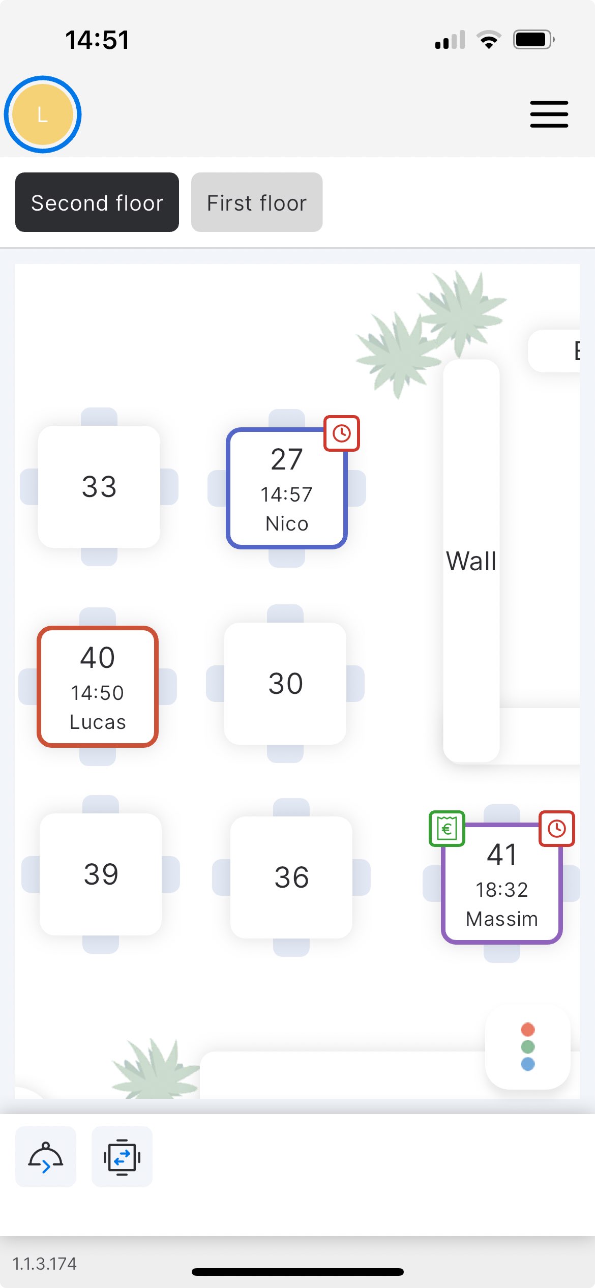
Table plan screen

The display of buttons on the Table plan screen in the app for phones is a bit different compared to the display on the Table plan screen in the app for tablets.
The actions bar is located in the bottom section where you can see the familiar icons of the 'Transfer table' and 'Fire next course' features.
For the list of icons used in unTill Air, refer to this page.
If you need to open the Table colour legend, you can tap on the button with three dots located in the right bottom corner.
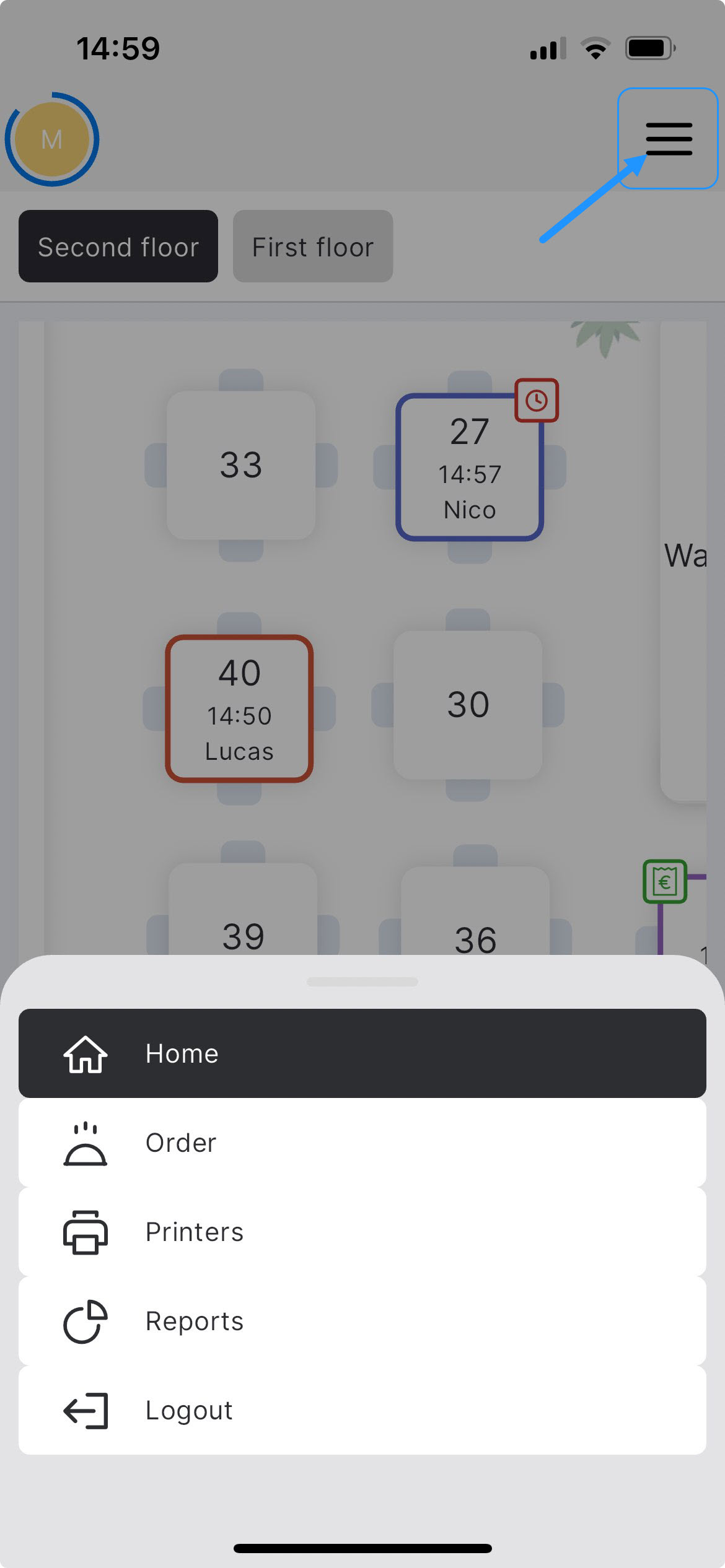
The navigation bar is located on the right side. Tap on the icon located in the right top corner to open the navigation bar.

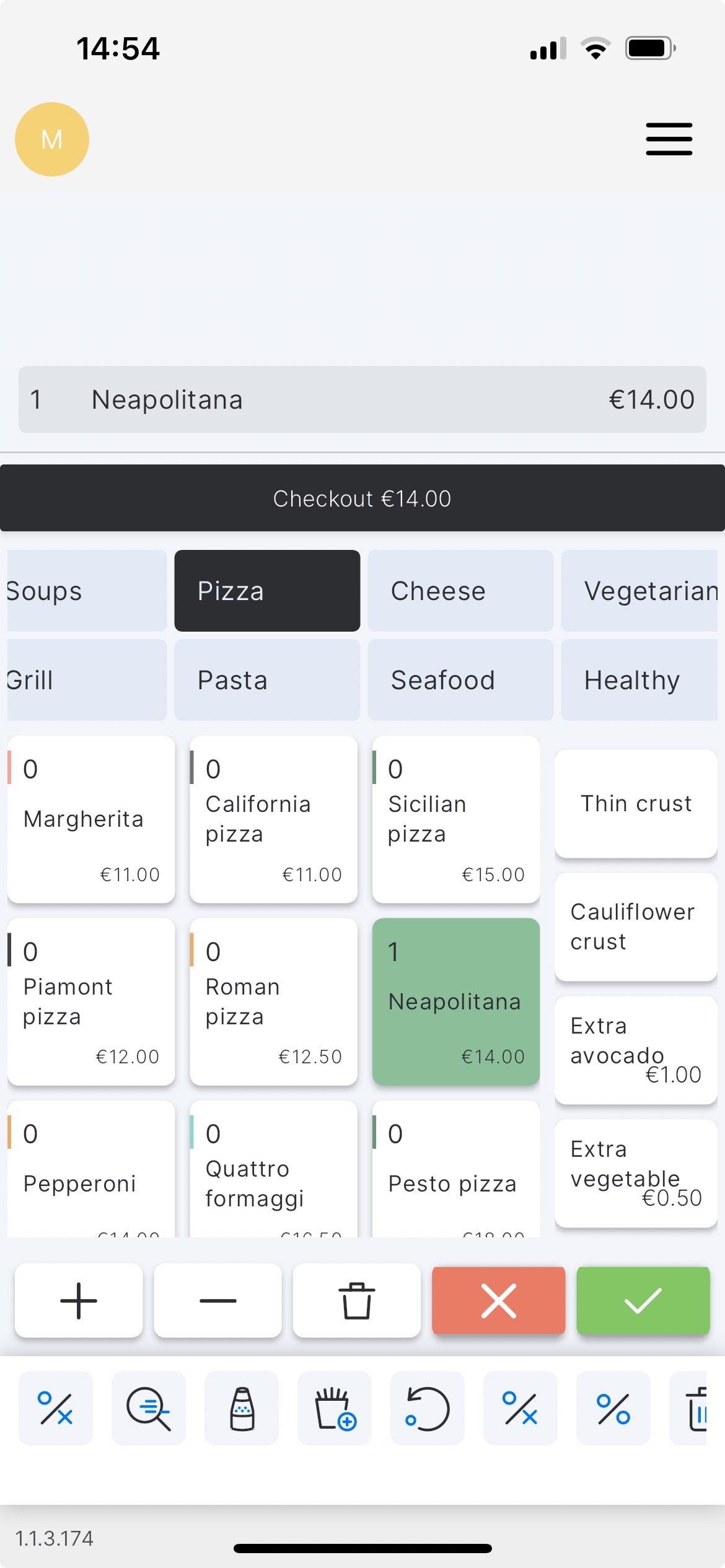
Order screen

The Articles ordered are shown in the upper section of the order screen. Under this section, the 'Checkout' button is located.
Further, you can see the Departments that can be scrolled into the right side. By tapping on the Department you can see the Articles incorporated. Scrolling of Articles is possible downward.
Tip: In the phone app, even though a numeric keypad is not constantly displayed, you can still enter the desired quantity of the Articles you wish to order. To do this, long-tap on the Article you want, and a pop-up with a numeric keypad will appear. From this pop-up, enter the required quantity.
The Modifiers are displayed in the right-side column, beside the Articles. Once the Article with the Modifiers assigned is selected, the Modifiers will appear in this column.
Tip: You can sort your Modifiers using the Free add-ons and Paid add-ons features. For more information, refer to this page.
Under the section of Articles and Modifiers, the buttons are located.
The 'green' button allows to confirm the order, and the 'red' button cancels the order and allows to leave the order screen.
'Plus' and 'minus' buttons serve to increase / reduce the number of the Article selected.
The icon featuring 'trash' helps to make a void.
As on the Table plan screen, the actions bar is located in the bottom section where you can find the icons of unTill Air features.
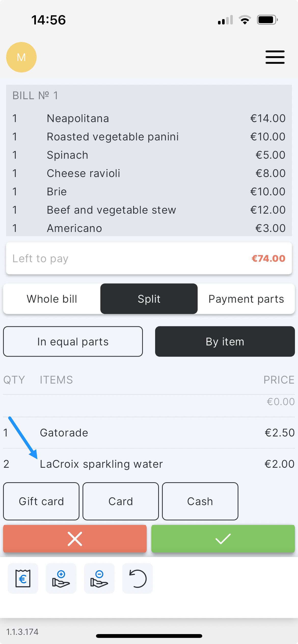
Payment screen
The bill is displayed in the upper section of the payment screen. Under this section, you can see the tabs that allow you to split the bill by three methods:
- In equal parts
- By item
- By payment parts
In the case of splitting in equal parts, the pop-up with a numeric keypad will appear right away after tapping on the corresponding tab.
If you need to split the bill by items and you have repeated items, you need to double-tap on them to get a pop-up with a numeric keypad.

If you need to split by payment parts, you can do this by switching to the relevant tab and tapping on the payment part. After this, you will see the pop-up with a numeric keypad. Enter the desired value.